-
Posts
24,885 -
Joined
-
Days Won
17
Content Type
Profiles
Forums
Events
Posts posted by Hawker
-
-
Thanks for the reports, both - should all be fixed now.
-
Thanks for the heads up @birdman - fixed now.

-
 1
1
-
-
Sorry, I didn't realise we were off - I've been visiting family.
-
 4
4
-
-
- Popular Post
- Popular Post
I wanted to highlight that the 2020 season has been fully summarised and fully screencapped, with all 260 episodes added to the archive.
You can view the season by clicking this link: Neighbours Episodes Summaries: 2020 season
I wanted to extend a huge thank you to all of the summarisers - @Tracy C, @Carly, @Clare, @Col, @wizardt™, @Skylover , @eviltwin, @Sayaka.
I also wanted to extend an equally huge thank you to @Graham for all of the caps, and to @Sayaka for all of the work on the archive.
Anyone who has summarised or capped in the past for us will know what an incredible investment of effort it is, and to consistently complete year on year is a fantastic achievement.
I think this is doubly true for a year which has been extremely unusual for us all; I greatly appreciate everyone's efforts.

-
 3
3
-
 5
5
-
 3
3
-
- Popular Post
- Popular Post
Following the discussion in Comments and Suggestions, I've made some changes to the reactions and their reputation values.
The new options are:
Like
Love
Thanks
Haha
Sad
Hug
Half agree
ConfusedAll icons, apart from Confused, earn the poster a reputation point of +1.
If you 'half agree' with someone, it would be great if you could post a reply and expand on the discussion, talking about what you agreed/disagreed with in their post.
We'll see how they go - as always, feedback is welcome.

-
 5
5
-
 2
2
-
 3
3
-
@J Bar - Hey Jim, thanks for reporting.
For my peace of mind, please can you test it on another message? I just want to rule out any potential problems - feel free to make any messages in here to test with.

There's been no change of setting, but I did make a silent board upgrade the other night and I'm just wondering if it's affected it.
-
- Popular Post
- Popular Post
100% - the efforts to keep the archive updated year on year are phenomenal, so a huge thank you to all those who summarise and cap, and to @Sayaka for all the archiving efforts.
Thanks also to those summarisers who knocked off the early years at the start of lockdown - we are far closer to completion than ever before.


-
 7
7
-
Marvellous, I'm pleased to hear that - and thank you again for the suggestions.

-
Hey Jim @J Bar - thanks for the suggestions.
I've implemented a few of these things - notably, I've added silent editing to your accounts and also the ability to hide your own content.
See how you go, and we'll look back in a few weeks and see if it's working or whether I need to do some adjusting with the member groups.
I'd be interested to know how people find the changes.

-
 1
1
-
-
@J Bar Hey Jim, I've been having a puzzle over this - it's definitely an unfortunate side effect of the move of the feature.
I understand the logic of why it's been moved, and due to how the post controls are linked into it (it's also where the moderator privileges sit), it's impossible to extricate.
...but would it help if I gave members permissions to hide your own content? Then at least you could 'get rid' of the mistake so the rest of the board can't see it, and the Staff can sweep the posts away when they log on?
-
@Starmaker73 - can you do the same, and clear the cache and cookies for the site on your phone browser? That should put it back into line.

@boatmate - great, glad that worked for you! No, there's not currently the option to mute a member.
-
 1
1
-
-
That's awesome to hear, thanks @J Bar

@boatmate - that sounds a bit odd. Can you check your settings under this link, please? https://www.neighboursfans.com/forum/settings/links/
I have mine set to 'take me to comments I haven't read' - can you check that yours are set to something suitable?
If there's no joy, it might be worth clearing the cache and cookie for the site in your browser to see if that puts things back into line.
-
That's brilliant to hear; glad you like it.

-
I'm really pleased that I could get a resolution for you.
 Thanks heaps for your patience whilst I had a look at it.
-
 1
1
-
-
Made a few other tweaks as well to the templates; I think it's looking better on desktop now too.
-
 3
3
-
-
It turns out I just needed to have a bit of a rest after work and the clouds parted in the code.

I was definitely overtired earlier in the week!
-
 2
2
-
-
-
Hi @ekane - yeah, the smallest view (which is what you'll generally see if you're on mobile) doesn't show any date/time details on the posts. I realise this is irritating - it's definitely on the to-do list.
-
7 minutes ago, boatmate said:
yes, I’m finding it much better.
On a larger screen (tablet or desktop) it shows how long ago the post was made (eg, you wrote the above 4 hours ago). This is easy to see when the post was made. It doesn’t show on mobile - is there any way to add it back in?
That's good to hear.

No, unfortunately not - that was what I was unsuccessfully hunting down for you last night (that, and moving the avatar).
 That smallest view is definitely the least friendly, I agree - I'll keep an eye out.
-
 1
1
-
-
I've split a set of posts from Neighbours Chat into this topic. @lozthyneighbours @emzynr @SydneyNeighboursFan @FootyKick - in future, please can you put feedback about the forum in this dedicated thread?
When it is posted in random topics across the forum, it is difficult to ensure that we've picked up all of the feedback - and it would be frustrating for you to feel that you've lodged a complaint without it being addressed.
As stated in this topic last night, it's not possible to address everything - but if I can make a minor change to improve things, then I am happy to do so. If I can't, then I'm happy to save the points for future reference, as two things usually happen - either we adjust to the current set up and in 12 months, things that were deemed a problem are no longer relevant, or developments are made in the codebase and we can make adjustments further down the line.
It would also be useful if you could raise the specific problems you're experiencing so that they can be investigated, rather than saying that you hate it.
To address the initial complaint:
On 01/10/2020 at 02:24, lozthyneighbours said:Am I the only one who hates the board like this? Much prefer the comments to be fully on the page after all that’s why most of us come on here to read and enter into the conversation. I don’t think we need whatever is on the right of the comments, well I don’t really look at it anyway. When comments are fully on the page you don’t need to hit expand or to scroll so far down. But anyways that’s imo.
I've made an adjustment to how this displays in topic view. It's now condensed into the topic, and can be clicked on optionally - which also returns the topic view back to being fullscreen on desktop.
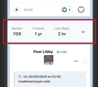
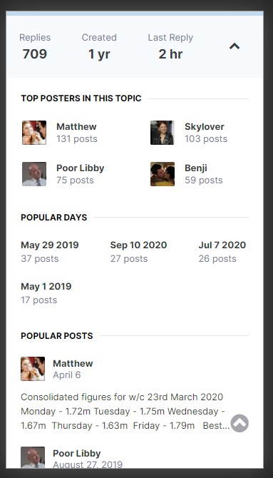
Here's an example from the mobile view.
The menu bar is now folded into the topic, highlighted here in red.

Clicking on the arrow on the right hand side loads the content:

Please can you let me know if that is more suitable?
-
 4
4
-
-
No, it's fine.
My problem is that my instinct is always to try to fix things for people - and I'll be honest, I did have a look earlier to see if it was something I could quickly fix on the fly.
Alas, the way the board is structured these days, it's really not simple to modify; if it had been, I'd have done it there and then.
-
Cheers for understanding - I will keep my eye out for improvements.

-
 1
1
-
-
10 hours ago, boatmate said:
Really don’t like the new look when on a mobile device. It is harder to navigate and each thread looks ugly. I don’t like how the profile picture is in the middle and it is harder to tell when the post was made.
Thank you for your feedback. I'm sorry to read that you are not a fan of the change.
I have said further up the thread that I will keep an eye on the developments from Invision, and if there is something more suitable for us to upgrade to in the future, I will do so.
The design choices are not ours - they are Invision's, who have determined what they believe to be the optimal design for each layout. The smaller your screen size, the less information is available visually. Depending on the size of your device, rotating it so it is landscape may cause a different view to load (it does on my device, but I have a large phone) - and the next size up offers information on when the post was made.
There are also other changes to the board software - so returning to a thread will take you to the first unread post, and you can further modify these settings to suit your posting / reading style in your account: https://www.neighboursfans.com/forum/settings/links/
In the past, I spent a lot of time (literally thousands of hours over the past 20 years) customising the site to ensure that people were content. However, my life has changed considerably and I no longer have the time to do these things - these changes which may seem trivial on the surface take a massive investment of time.
I appreciate you might find this disappointing, but I wanted to advise you of what the current situation is so you didn't have false expectations.
If you find that it's unusable, you could request that your mobile browser fetches the desktop site (which is usually a toggle in the menu of your browser) as an alternative.
-
 6
6
-
-
I've made an edit to your account - please could you look over the setting now and see if you can see the option? @daydreambeliever


Neighboursepisodes.com
in Forum News
Posted
Cheers for the report - I got it back up a few minutes later.